The Internet Movie Database (IMDb) is a rich source of online movie information. The problem is, the true gold is buried deep beneath the site’s user-friendly exterior and hidden within the database itself. With a little digging, however, we can extract the gold, nugget by nugget, and learn about fun statistical tools for data analysis.
Today, in the first part of our analysis, we will put our intuition about rating systems to the test. We will decode IMDb “user ratings,” those numbers such as 6.1 and 7.8 that summarize how the registered users of the IMDb rated movies on a scale from 1 to 10, typically depicted as a series of stars on the screen:

We will extract the collective wisdom of registered IMDb users in order to convert a movie’s user rating into the movie’s standing within the database. This gives us a good indicator of how the movie stacks up against other movies in general, and that’s good information to have when deciding which movies to see in the theater or add to your Netflix list.
Ready to start digging? Let’s go!
Getting to know user ratings: fundamental descriptive statistics
Like most online movie databases, the IMDb encourages its users to rate movies on a numerical scale, in this case from 1 to 10. The IMDb software averages these ratings into a composite “user rating” for each movie. King Kong, for example, currently has a user rating of 7.8. Transporter 2, on the other hand, has a user rating of 6.1.
Certainly, we have some sense of what these ratings mean. A 6.1, for example, is somewhat higher than the midpoint of the 1-to-10 scale. Thus we might expect a 6.1-rated movie to be somewhat better than the typical movie. But is this expectation justified? Also, we know a 7.8 is better than a 6.1. But how much better? Is it 1.7 stars better? And, if so, what does that mean?
To understand what user ratings mean, we must put them into context. Let’s assume that buried within the IMDb is some kind of useful information that reflects the collective wisdom of the site’s users. When a movie is rated 7.8, we will assume that the rating means the movie is “better” than lower-rated movies and “worse” than higher-rated movies. To what degree, we don’t know for sure, but that is what we are about to find out.
While we might not know what it means for a movie to be a “7.8,” we probably do have a genuine sense for what it means for a movie to be among the best of movies, or among the worst, or among the middle of the pack. We have developed this sense by experience, by watching movies over our lifetimes. What we need is some way of converting the number 7.8 into something that registers with this hard-earned experience.
As a starting point, let’s examine the most fundamental descriptive statistics of the IMDb’s user ratings:
| Count | Mean | Median | Std. Dev. |
| 23,396 | 6.2 | 6.4 | 1.4 |
Breaking them down:
- count – There are 23,396 user ratings in the database. (There are actually more, but to eliminate fringe movies I am considering only those movies that have been rated by more than 100 users.)
- mean – The average user rating is 6.2. While some ratings are lower and others higher, if you were to put all of the ratings in a blender and purée them into a homogeneous soup, the soup’s overall rating would balance out to 6.2.
- median – The rating that divides the database in half. Ratings higher than 6.4 fall into the better half; ratings lower than 6.4, the worse half.
- standard deviation – This is a measure of how spread out the ratings are. Assuming the distribution of the ratings has a bell-curve shape, which we will investigate in a moment, about 68 percent of the ratings will fall within one standard deviation of the mean, i.e., in the range 6.2 +/- 1.4 = 4.8 to 7.6.
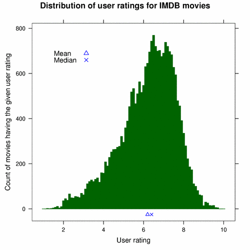
Another way to examine the ratings is graphically. The following chart, called a histogram, shows how many movies had each possible user rating:

The ratings form a pointy bell curve. It’s easy to see that few movies have ratings lower than 4 or higher than 8; most movies fall in between. The movies are most densely packed in the range that is a bit higher than 6 and a bit lower than 8. I have plotted the mean (the triangle) and median (the “X”) along the bottom of the chart to put them into perspective.
Exploring the extremes
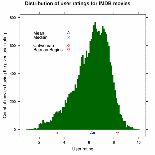
With this information, we can begin to make crude interpretations of user ratings. Say we hear that Catwoman has a user rating of 3.4. Before we looked at the histogram, we probably could have guessed that the movie was not good. (We may even have heard as much from friends.) But now that we have seen the histogram, we know that very few movies had a rating lower than 4, let alone 3.4, and so we know the movie is among the worst ever released. It is, no pun intended, an outright dog.
On the other side of the spectrum, Batman Begins has a user rating of 8.3. Since we know that few movies rate better than 8, we know that this movie is probably among the very best.
The following histogram shows where both movies stand:

So far, we understand the extremes of the rating system. Movies lower than 4 are probably terrible, and movies higher than 8 are probably great. No doubt, that is useful information. But, what about that big lump in the middle which represents the bulk of movies? That is where there real gold is hidden. To get it, we must dig deeper.
Charting the inner masses
We already know Catwoman is bad, but how bad is it? One way to quantify its badness is to count how many movies in the database are equally bad or worse, and compare that count to the size of the entire database. In the database, there are 1,060 movies with Catwoman’s 3.4 user rating or lower. The size of the entire database is 23,396 movies. Dividing the first number by the second, we find that Catwoman is among the worst 5 percent of movies the database. It is in the 5th percentile.
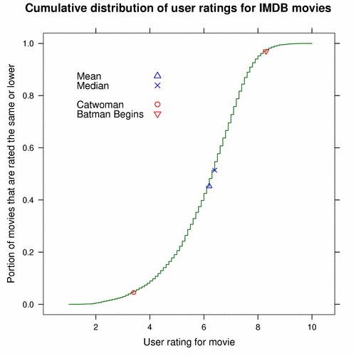
We just turned a 3.4 user rating into a percentage that tells us where 3.4-rated movies stand with respect to all of the movies within the database. If we repeat the process for all possible movie ratings and plot the results, we get a chart like this:

Each point on the S-shaped curve relates a movie’s rating with its standing in the database. The circle on the lower portion of the curve, for example, represents Catwoman. Its position corresponds to a 3.4 user rating on the horizontal axis and a 0.05 portion (5 percent) on the vertical axis. Thus a 3.4-rated movie is in the 5th percentile. The triangle on the upper portion of the curve corresponds to Batman Begins, relating the movie’s 8.3 rating to its glorious standing in the 97th percentile.
Because the curve covers all ratings, not just the extremes, we now have a way to quantify the goodness or badness of middle-ground movies. Let’s return to King Kong, currently rated 7.8, and Transporter 2, currently rated 6.1. Look up their percentiles on the curve above. (Try it.) If you are careful, you should get close to the actual values of 91 and 42, respectively.
This would be a good time to reflect upon our intuition about user ratings. Earlier, we thought a 6.1 user rating suggested that a movie was somewhat better than the typical movie. Now, however, we see that a 6.1 is worth somewhat less than is typical.
Even though their ratings differ by only 1.7 user-rating units, King Kong is in the 91st percentile – very good – and Transporter 2 is way down in the 42nd percentile – not so good. To look at the difference another way, about half of the movies in the database fall in between Transporter 2 and King Kong: 0.91 – 0.42 = 0.49. A small difference in user ratings can represent a large difference in standings, which might further challenge our intuition about ratings.
Additionally, differences in standings are not proportional to differences in user ratings. Catwoman, for example, has a user rating of 3.4 and falls into the 5th percentile. Transporter 2, with its 6.1 user rating, is a whole 2.7 user-rating units away from Catwoman, but only 37 percent of movies stand between them. Even though Transporter 2 is closer to King Kong in terms of user ratings, it is really closer to Catwoman in terms of standing.
Movie-rating decoder ring
A chart is great for understanding the relationship between user ratings and movie standings, but it is not ideal for day-to-day use, when we just want to figure out where a movie stands before deciding whether it is worth watching. For times like that, a lookup table is a convenient alternative. The table below, for example, summarizes the rating-standing relationship in a convenient “decoder-ring” format. Find a movie’s rating in the left column, and the corresponding entry in the right column gives the movie’s standing.
| Rating | Percentile |
|---|---|
| 4.00 | 8 |
| 5.00 | 19 |
| 5.25 | 22 |
| 5.50 | 29 |
| 5.75 | 33 |
| 6.00 | 40 |
| 6.25 | 45 |
| 6.50 | 55 |
| 6.75 | 61 |
| 7.00 | 70 |
| 7.25 | 76 |
| 7.50 | 84 |
| 7.75 | 89 |
| 8.00 | 94 |
| 8.25 | 96 |
| 8.50 | 98 |
| 8.75 | 99 |
| 9.00 | 100 |
Using King Kong as an example again, let’s look up 7.8. It turns out that 7.8 is not in the table, but 7.75 is, and it corresponds to the 89th percentile. So we can guesstimate that King Kong is a bit above the 89th percentile, which, as we know from earlier, is correct, the actual value being 91. The decoder ring is not as precise as the chart, but it is more than good enough for finding a movie’s approximate standing quickly – something that might be handy on a Friday night.
Summary: weighing the gold
What have we dug up so far? First, we computed a few essential descriptive statistics of the IMDb’s user ratings. We learned that the average rating is 6.2 and that the median, which divides the ratings into better and worse halves, is 6.4.
Second, we plotted a histogram in order to inspect the ratings visually. Right away, we could tell that movies rated lower than 4 are among the very worst, and movies rated higher than 8 are among the very best.
Third, in order to give more meaning to ratings in between those two extremes, we turned to percentiles. We computed Catwoman’s by hand; it’s in the 5th percentile – ouch! Then we plotted a curve that represents the relationship between user ratings and percentiles. Using this curve we determined that King Kong is in the 91st percentile and Transporter 2 is in the 42nd percentile – a large difference in movie standings.
Finally, we created a tabular “decoder ring” to summarize what the curve depicted. It is a quick and easy way to find a movie’s standing given its user rating.
That concludes our first dig of the Internet Movie Database. Next time, we will examine the factors that influence movie ratings. Are Documentaries better than Horror flicks? Are old movies generally better than new movies? We will ask those questions and more in the next part of the series.
Until then, enjoy a movie or two. And don’t forget your slide-rule.
Acknowledgments
The movie information used in this article is courtesy of The Internet Movie Database and used with permission.
Second, my analysis was performed with R software from the R Project for Statistical Computing. R is a great statistics package. It’s Free Software, and it has a great community around it. Do check it out.